Pricing
How to
Utility Classes
The Draft Pro plugin uses ALMOST all of the default TailwindCSS utility classes ( we say almost b/c we didn’t include all of the color utilities, but don’t worry you can add custom colors ) plus a few WordPress specific utilities.
The Free Draft plugin gives you access to all the responsive Margin, Padding, Display, and Flex-Basis utilities.
Prefixed for your protection. We’ve prefixed all utility classes with ‘tw-‘ to prevent styling collisions with plugins or themes that may also use similarly named utility classes.
For more information on any utility class we highly recommend checking out the official TailwindCSS documentation.
Utilities Not Found in TailwindCSS
There are several utilities that aren’t found in the default TailwindCSS configuration and are unique to Draft.
color
Color utilities are found in TailwindCSS, however we didn’t include any of the default color packages ( we do recommend referencing their curated palettes for color ideas! ). We did this b/c we couldn’t pick just one ( or even a couple ) and we tried including all of them but the plugin just got too big.
Instead we’ve defined a handful contextual and sequential color utility classes that you can configure yourself. These come in handy when you’re working from a brand or business defined color palette and they really speed up your website building workflow.
The hard part is choosing the right color slot for your colors.
The color configuration is an incredibly powerful tool that also drives a handful of utility classes including:
- Background Color ( bg-primary, bg-secondary… )
- Text Color ( text-primary, text-secondary… )
- Border Color ( border-primary, border-secondary… )
- Placeholder Color ( placeholder-primary, placeholder-secondary… )
- Divide Color ( divide-primary, divide-secondary… )
- Ring Color ( ring-primary, ring-secondary… )
- Background Gradient Colors ( from-primary, to-secondary… )
Setting the color defaults is a bit of an art. We’ve given you a handful of context driven color utility names, such as Background, Foreground, Primary, Secondary, Light & Dark.
We’ve also added 8 additional custom color utility slots that sequentially follow the naming pattern of Primary 1st and Secondary 2nd ( tertiary 3rd, quaternary 4th, quinary 5th, senary 6th, septenary 7th, octonary 8th, nonary 9th, denary 10th ).
Here are all the color utility slots:
- Background ( bg-background, bg-background… )
- Foreground ( bg-foreground, text-foreground… )
- Primary ( bg-primary, text-primary… )
- Secondary ( bg-secodary, text-secondary… )
- Tertiary ( bg-tertiary, text-tertiary… )
- Quaternary ( bg-quaternary, text-quaternary… )
- Quinary ( bg-quinary, text-quinary… )
- Senary ( bg-senary, text-senary… )
- Septenary ( bg-septenary, text-septenary… )
- Octonary ( bg-octonary, text-octonary… )
- Nonary ( bg-nonary, text-nonary… )
- Denary ( bg-denary, text-denary… )
- Light ( bg-light, text-light… )
- Dark ( bg-dark, text-dark… )
| Class Name | Property Value |
|---|---|
| bg-background, bg-foreground, bg-primary, bg-secondary, bg-tertiary, bg-quaternary, bg-quinary, bg-senary, bg-septenary, bg-octonary, bg-nonary, bg-denary, bg-dark, bg-light | background-color: var(--tw-color-primary);background-color: var( --tw-color-secondary);etc. |
| text-background, text-foreground, text-primary, text-secondary, text-tertiary, text-quaternary, text-quinary, text-senary, text-septenary, text-octonary, text-nonary, text-denary, text-dark, text-light | color: var(--tw-color-primary);color: var( --tw-color-secondary);etc. |
| border-background, border-foreground, border-primary, border-secondary, border-tertiary, border-quaternary, border-quinary, border-senary, border-septenary, border-octonary, border-nonary, border-denary, border-dark, border-light | border-color: var(--tw-color-primary);border-color: var( --tw-color-secondary);etc. |
| placeholder-background, placeholder-foreground, placeholder-primary, placeholder-secondary, placeholder-tertiary, placeholder-quaternary, placeholder-quinary, placeholder-senary, placeholder-septenary, placeholder-octonary, placeholder-nonary, placeholder-denary, placeholder-dark, placeholder-light | placholder-primary::placeholder { color: var( --tw-color-primary);} placholder-secondary::placeholder { color: var( --tw-color-secondary);} etc. |
divide-background, divide-foreground, | border-color: var(--tw-color-primary);border-color: var( --tw-color-secondary);etc. |
| ring-background, ring-foreground, ring-primary, ring-secondary, ring-tertiary, ring-quaternary, ring-quinary, ring-senary, ring-septenary, ring-octonary, ring-nonary, ring-denary, ring-dark, ring-light | --tw-ring-color: var(--tw-color-primary);--tw-ring-color: var(--tw-color-secondary);etc. |
| from-background, from-foreground, from-primary, from-secondary, from-tertiary, from-quaternary, from-quinary, from-senary, from-septenary, from-octonary, from-nonary, from-denary, from-dark, from-light | --tw-gradient-from: var(--tw-color-primary);--tw-gradient-stops: var(--tw-gradient-from), var(--tw-gradient-to, rgba(255,255,255,0)); |
| to-background, to-foreground, to-primary, to-secondary, to-tertiary, to-quaternary, to-quinary, to-senary, to-septenary, to-octonary, to-nonary, to-denary, to-dark, to-light | --tw-gradient-to: var(--tw-color-primary); |
| via-background, via-foreground, via-primary, via-secondary, via-tertiary, via-quaternary, via-quinary, via-senary, via-septenary, via-ocvianary, via-nonary, via-denary, via-dark, via-light | --tw-gradient-stops: var(--tw-gradient-from), var(--tw-color-primary), var(--tw-gradient-to, rgba(255,255,255,0) ); |
font
Font family utilities are also found in TailwindCSS and we’ve included all of the default font family utilities ( font-sans, font-serif, font-mono ).
We’ve also included 2 contextual font-family utilities (heading & body) and 3 custom font-family slots that follow a similar naming pattern as the colors, sequentially following the naming pattern of primary (1st), secondary (2nd), and tertiary (3rd).
There is a caveat to the font configuration settings. The font-family that you use needs to be available on your site, such as through a plugin or theme. We’ve included ALL the google fonts so you should have lots of options 🙂
| Class Name | Property Value |
|---|---|
| font-heading | var(–tw-font-heading) |
| font-body | var(–tw-font-body) |
| font-primary | var(--tw-font-primary); |
| font-secondary | var(--tw-font-secondary); |
| font-tertiary | var(--tw-font-tertiary); |
WordPress Specific Utilities
We’ve baked in one WordPress specific utility classes that you won’t find in the TailwindCSS documentation.
flex-basis
The flex-basis utility classes are for using with core column blocks. Core column blocks use flex-basis for their sizing, so we added flex-basis so you can easily add responsive styling to columns.
IMPORTANT – This has since been added to TailwindCSS v3+. I’m leaving it here b/c it’s an important utility for responsively styling gutenberg column blocks.
| Class Name | Property Value |
|---|---|
basis-1/2 | flex-basis:50%; |
| flex-basis:33.333333%; |
| flex-basis:66.666667%; |
| flex-basis:25%; |
| flex-basis:50%; |
| flex-basis:75%; |
| flex-basis:20%; |
| flex-basis:40%; |
| flex-basis:60%; |
| flex-basis:80%; |
| flex-basis:16.666667%; |
| flex-basis:33.333333%; |
| flex-basis:50%; |
| flex-basis:66.666667%; |
| flex-basis:83.333333%; |
| flex-basis:8.333333%; |
| flex-basis:16.666667%; |
| flex-basis:25%; |
| flex-basis:33.333333%; |
| flex-basis:41.666667%; |
| flex-basis:50%; |
| flex-basis:58.333333%; |
| flex-basis:67.666667%; |
| flex-basis:75%; |
| flex-basis:83.333333%; |
| flex-basis:91.666667%; |
| flex-basis:100%; |
Variants
Each utility class in both the Free & Pro Draft plugins comes with additional styling properties, which are called variants.
Essentially, you tack on a variant name to any utility class to apply that variants styling.
sm: & md:
Responsive Variants
In the Responsive Design section below we walk through the mobile ( sm: ), tablet ( md: ), and desktop variants and how to use them.
For example, if you wanted to apply different font sizes on mobile, tablet, and desktop you would simply apply the font size utility class you want for desktop as well as the mobile and tablet variants you want, like this:
<h1 class="tw-text-5xl md:tw-text-3xl sm:tw-text-2xl">Variants</h1>Every utility class comes with the default utility class that applies to all device sizes and then md: variants for tablet and sm: variants for mobile.
hover: & focus: & group-hover:
State Variants
A handful of utility classes also come equipped with hover:, focus: and group-hover: variants for doing things such as adding alternate background colors for buttons on hover.
An example of using these variants could be:
<button class="tw-bg-primary hover:tw-bg-secondary">Hover Variants</button>You can also use each of these variants in combination with any of the device breakpoint variants:
<button class="tw-bg-primary hover:tw-bg-secondary sm:hover:tw-bg-accent">Hover Variants</button>child: & logged-in:
WordPress Specific Variants
There are two custom variants that we added called :child & :logged-in.
The :child variant gives you the ability to apply certain utilities to the children of a parent element. We added this mainly for styling the padding & display properties of the core button block in WordPress.
This would look something like this and would apply padding to the button’s child element:
<button class="child:tw-px-12 md:child:tw-py-8 sm:child:tw-px-8 sm:child:tw-py-4"><a>Hover Variants</a></button>The :logged-in variant gives you the ability to apply certain utilities when a user is logged in. We added this for displaying certain page elements when someone is logged in/out or for accounting for the admin bar.
Here’s an example we use to apply specific styling to a header when someone is logged in:
<!-- wp:template-part {"className":"tw-fixed tw-w-full logged-in:tw-top-8 md:logged-in:tw-top-11.5 tw-z-20 tw-bg-gradient-to-b tw-from-neutral","slug":"header","tagName":"header"} /-->sm: & md: & hover: & focus: & group-hover: & logged-in: & child:
All the Variants
Below are all the utility classes and their variants:
| accessibility | responsive |
| alignContent | responsive |
| alignItems | responsive |
| alignSelf | responsive |
| animation | responsive |
| appearance | responsive |
| backdropBlur | responsive |
| backdropBrightness | responsive |
| backdropContrast | responsive |
| backdropFilter | responsive |
| backdropGrayscale | responsive |
| backdropHueRotate | responsive |
| backdropInvert | responsive |
| backdropSaturate | responsive |
| backdropSepia | responsive |
| backgroundAttachment | responsive |
| backgroundBlendMode | responsive |
| backgroundClip | responsive |
| backgroundColor | responsive, hover, focus, group-hover |
| backgroundImage | responsive |
| backgroundOpacity | responsive, hover, focus, group-hover |
| backgroundPosition | responsive |
| backgroundRepeat | responsive |
| backgroundSize | responsive |
| backgroundOrigin | responsive |
| blur | responsive |
| borderCollapse | responsive |
| borderColor | responsive, hover, focus, group-hover |
| borderOpacity | responsive, hover, focus, group-hover |
| borderRadius | responsive |
| borderStyle | responsive |
| borderWidth | responsive |
| boxDecorationBreak | responsive |
| boxShadow | responsive, hover, focus, group-hover |
| boxSizing | responsive |
| brightness | responsive |
| clear | responsive |
| container | responsive |
| contrast | responsive |
| cursor | responsive |
| display | responsive, child |
| divideColor | responsive |
| divideOpacity | responsive |
| divideStyle | responsive |
| divideWidth | responsive |
| dropShadow | responsive |
| fill | responsive |
| filter | responsive |
| flex | responsive |
| flexDirection | responsive |
| flexGrow | responsive, child |
| flexShrink | responsive |
| flexWrap | responsive |
| float | responsive |
| fontFamily | responsive |
| fontSize | responsive |
| fontSmoothing | responsive |
| fontStyle | responsive |
| fontVariantNumeric | responsive |
| fontWeight | responsive |
| gap | responsive |
| gradientColorStops | responsive, hover, focus |
| grayscale | responsive |
| gridAutoColumns | responsive |
| gridAutoFlow | responsive |
| gridAutoRows | responsive |
| gridColumn | responsive |
| gridColumnEnd | responsive |
| gridColumnStart | responsive |
| gridRow | responsive |
| gridRowEnd | responsive |
| gridRowStart | responsive |
| gridTemplateColumns | responsive |
| gridTemplateRows | responsive |
| height | responsive |
| hueRotate | responsive |
| inset | responsive |
| invert | responsive |
| isolation | responsive |
| justifyContent | responsive |
| justifyItems | responsive |
| justifySelf | responsive |
| letterSpacing | responsive |
| lineHeight | responsive |
| listStylePosition | responsive |
| listStyleType | responsive |
| margin | responsive |
| maxHeight | responsive |
| maxWidth | responsive |
| minHeight | responsive |
| minWidth | responsive |
| mixBlendMode | responsive |
| objectFit | responsive |
| objectPosition | responsive |
| opacity | responsive, hover, focus, group-hover |
| order | responsive |
| outline | responsive, focus |
| overflow | responsive |
| overscrollBehavior | responsive |
| padding | responsive, child |
| placeContent | responsive |
| placeItems | responsive |
| placeSelf | responsive |
| placeholderColor | responsive, focus |
| placeholderOpacity | responsive, focus |
| pointerEvents | responsive |
| position | responsive |
| resize | responsive |
| ringColor | responsive, focus |
| ringOffsetColor | responsive, focus |
| ringOffsetWidth | responsive, focus |
| ringOpacity | responsive, focus |
| ringWidth | responsive, focus |
| rotate | responsive, hover |
| saturate | responsive |
| scale | responsive, hover |
| sepia | responsive |
| skew | responsive, hover |
| space | responsive |
| stroke | responsive |
| strokeWidth | responsive |
| tableLayout | responsive |
| textAlign | responsive |
| textColor | responsive, hover, focus, group-hover |
| textDecoration | responsive, hover, focus, group-hover |
| textOpacity | responsive, hover, focus, group-hover |
| textOverflow | responsive |
| textTransform | responsive |
| transformOrigin | responsive |
| transitionDelay | responsive |
| transitionDuration | responsive |
| transitionProperty | responsive |
| transitionTimingFunction | responsive |
| translate | responsive, hover |
| userSelect | responsive |
| verticalAlign | responsive |
| visibility | responsive |
| whitespace | responsive |
| width | responsive |
| wordBreak | responsive |
| zIndex | responsive, hover |
Responsive Design
You can easily apply different utility classes depending on what device the website is being viewed on.
To apply a different utility class depending on the device, simply select Mobile, Tablet, or Desktop:
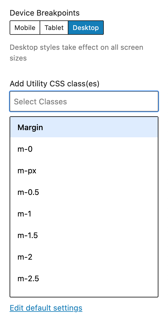
Any utility classes added for Desktop devices apply to ALL device sizes. You can then override the Desktop utility class on Tablet or Mobile by choosing a utility from either of these categories.
The device breakpoints are:
- Mobile ( sm: ) 767px
- Tablet ( md: ) 1023px
- Desktop All Screen Sizes
If you’re familiar with responsive website design/development, the Draft plugin uses a max-width ( desktop 1st ) break-point strategy, as opposed to a min-width ( mobile 1st ) breakpoint strategy. We’re assuming most WordPress website editing happens from a desktop computer.