Configure Tailwind CSS
The Draft Pro plugin comes armed with a complete DESIGN SYSTEM that you can configure to fit your needs. Ultimately, this gives you the ability to quickly build beautiful and cohesive sites by applying consistent and on-brand styling.
The default design system comes loaded with amazing, and sensible, defaults defined by the Tailwind CSS team.
From the plugin settings, you can modify the default Tailwind CSS configuration.
Configure Utility Classes
To edit the default Tailwind CSS configuration go to the Config tab:
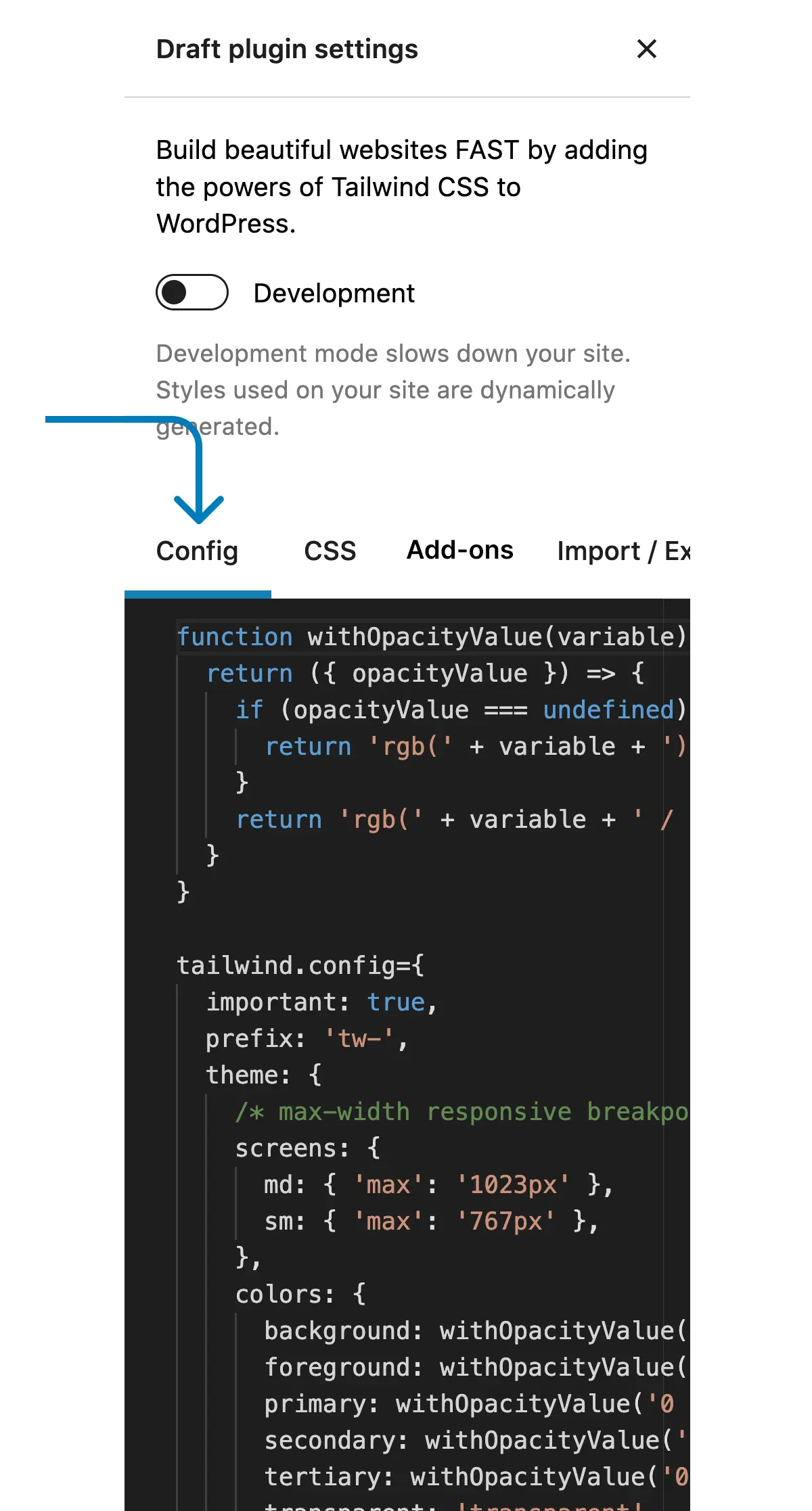
Default Config
The Draft plugin ships with a lightweight default configuration that mostly leverages the Tailwind CSS defaults. This is the configuration we use for creating all our block patterns and for building websites. We’ve found this configuration to be lightweight, yet flexible.
There are a few important things you’ll notice:
- colors
- Colors are added under the under the ‘colors’ key, not the ‘extend’ key. Because of this, these colors override all the default Tailwind CSS colors. We do this mainly to speed up the utility class selector interface, otherwise thousands of additional utility classes would get added to a block’s utility class selector.
- You can use whatever naming strategy you prefer, however we use a specific color naming strategy that we use to create block patterns, page layouts, and eventually full websites. This allows all Draft plugin users to have standardized utility class tokens so you can easily drop in WordPress block patterns and pages while consuming a sites default styles. To learn more about the color naming and how it gets applied check out the colors section below.
- Default color utilities are added under the ‘extend’ key so you can quickly use default color tokens like bg-primary and write bg-primary instead of bg-primary-900 or text-accent instead of text-accent-500.
- important
- Important is set to true. We highly recommend doing this as utility classes applied directly to block should be given top priority, just like using inline styles.
- screens
- Breakpoints are set to use max-width values as we’re assuming most WordPress editing will be done on a laptop or desktop. We also only use 2 breakpoints, sm: for mobile devices and md: for tablets. All utility classes that are added without a breakpoint variant prefix get applied at all device sizes. Of course, you can add whatever breakpoints you want.
- fontFamily
- Unlike the colors, the fontFamily utilities under the theme > extend key. This way all the default fontFamily utilities get generated as well ( font-sans, font-mono, font serif ). If you want to speed up the utility class selector that gets added to all WordPress blocks, just move these directly under the theme key instead of under extend.
- Like colors, there is a set of standardized tokens for fontFamily naming so you can easily drop in WordPress block patterns and pages while consuming a sites default styles. To learn more about the fontFamily naming and how it gets applied check out the fontFamily section below.
- corePlugins
- Finally, since Draft works with any WordPress plugin or theme, preflight has been disabled so it doesn’t interfere with any other plugin or theme styling. If you’re using the Draft plugin & theme, you can go ahead and remove this from your config.
Default Tailwind CSS config
var tailwind = !!tailwind ? tailwind : window.tailwind;

tailwind.config = {
  important: true,
  darkMode: 'selector',
  theme:
  {
    /* max-width responsive breakpoints */
    screens:
    {
      md:
      {
        'max': '1023px'
      },
      sm:
      {
        'max': '767px'
      },
    },
    colors:
    {
      primary: tailwind.colors.slate,
      secondary: tailwind.colors.white,
      text: tailwind.colors.slate,
      accent: tailwind.colors.sky,
      transparent: tailwind.colors.transparent,
      current: tailwind.colors.current,
    },
    extend:
    {
      boxShadow:
      {
        inset: 'inset 0 1px 0 0 rgb(255 255 255 / 20%)',
      },
      colors:
      {
        primary:
        {
          DEFAULT: tailwind.colors.slate['900']
        },
        secondary:
        {
          DEFAULT: tailwind.colors.white
        },
        text:
        {
          DEFAULT: tailwind.colors.slate['600']
        },
        accent:
        {
          DEFAULT: tailwind.colors.sky['500']
        }
      },
      fontFamily:
      {
        primary: [
          'Inter',
          {
            fontFeatureSettings: '"cv11", "ss01"',
            fontVariationSettings: '"opsz" 32'
          }
        ],
        secondary: [
          'Inter',
          {
            fontFeatureSettings: '"cv11", "ss01"',
            fontVariationSettings: '"opsz" 32'
          }
        ],
        text: [
          'Inter',
          {
            fontFeatureSettings: '"cv11", "ss01"',
            fontVariationSettings: '"opsz" 32'
          }
        ],
        accent: [
          'Inter',
          {
            fontFeatureSettings: '"cv11", "ss01"',
            fontVariationSettings: '"opsz" 32'
          }
        ],
      },
      listStyleType:
      {
        circle: 'circle',
        square: 'square',
      },
    },
  },
  corePlugins:
  {
    preflight: false,
  },
}
Colors
The color configuration is an incredibly powerful tool that also drives a handful of utility classes including:
- Background Color ( bg-primary, bg-secondary… )
- Text Color ( text-primary, text-secondary… )
- Border Color ( border-primary, border-secondary… )
- Placeholder Color ( placeholder-primary, placeholder-secondary… )
- Divide Color ( divide-primary, divide-secondary… )
- Ring Color ( ring-primary, ring-secondary… )
- Background Gradient Colors ( from-primary, to-secondary… )
Setting the color defaults is a bit of an art. There are a handful of context driven color utility tokens, such as Primary, Secondary, Text, & Accent.
When we’re building block patterns, page layouts, and full websites using Draft, this is how we map colors:
- primary – Heading Elements ( h1-h6 )
- secondary – List Items, Subheadings, and Price Table backgrounds
- text – Paragraphs & Menu items
- accent – Links & Button backgrounds
| primary | tailwind.colors.slate |
| secondary | tailwind.colors.white |
| text | tailwind.colors.slate |
| accent | tailwind.colors.sky |
| transparent | tailwind.colors.transparent |
| current | tailwind.colors.current |
Font Family
You can also set custom font-family values to use in addition to the default font-family utilities of font-sans, font-serif, font-mono ( font-primary, font-secondary… ).
You have 4 contextual font-family tokens ( primary, secondary, text, accent ), font-family slots that follow a similar naming pattern as the colors.
When we’re building block patterns, page layouts, and full websites using Draft, this is how we map font families:
- primary – Heading Elements ( h1-h6 )
- secondary – List Items, Subheadings, and Price Table backgrounds
- text – Paragraphs & Menu items
- accent – Links & Button backgrounds
There is a caveat to the font configuration settings. The font-family that you use needs to be available on your site, such as through, WordPress, a plugin, or a theme.
| primary | ‘Inter’ |
| secondary | ‘Inter’ |
| text | ‘Inter’ |
| accent | ‘Inter’ |